What do you think of when you hear the words “neutral color scheme”? Some see a calm and unobtrusive style. Others see a blank slate on which they can make their own mark. And still others think of one word: Boring.
And yet, neutrals endure. Beige, tan, white, off-white, sand. Dozens of colors fall under the traditional umbrella as a neutral tone. “The meaning of the word "neutral" in design has evolved over time,” says Leigh Spicher, national director of design studios for luxury homes builder Ashton Woods. “In the '90s, neutral was synonymous with beige. Beige everything. Beige paint, beige carpet, beige tile, even the atrocity that was beige laminate. Oh, don't forget beige laminate cabinets. Then, we transitioned out of beige and into stark white being used for everything—wall paint, trim color, appliances and furnishings.”
However Spicher sees the design ship turning—sort of. “After more than a decade of stark white and minimalism, we are going back to a generation of sophisticated style that includes dark, warm wood cabinets and floors that are rich in character. White is replaced with warm, earthy colors like walnut, sage and even charcoal.”
:max_bytes(150000):strip_icc()/RAL_BCK_Greenville_LIVE_1-f53eb07d500a400191273d853cc0a9a0.jpg)
Ashton Woods Home
Have Neutrals Had Their Day?
“Neutrals are an integral part of my design work, so I don’t see them ever going out of style,” says celebrity designer Bobby Berk. “We’ve seen more muted color schemes work in so many different styles over many decades, so I think that’s what’s the key to their longevity (and appeal). They can be translated to a super modern space, something more rustic, coastal, or even eclectic/boho interiors.”
In the '90s, neutral was synonymous with beige. Beige everything. Beige paint, beige carpet, beige tile, even the atrocity that was beige laminate.
L.A.-based designer Rande Leaman agrees. “Nope. They will never go out of style,” she says. “As a designer, I don’t even question that, because it seems every design scheme I approach is always grounded with neutrals. Even if I am using vivid color, I will always balance color with neutrals.”

The Evolution of 'Neutral'
The meaning of the word has evolved over the years. Designs still include one of the many dozens of shades of beige or white. But “neutral” has extended its reach and includes some shades that you might not have considered.
“In the 1930s, whites and ivories were prevalent,” Leaman says. “Now we are in a whole other thing, with soft grays that have come to the forefront. It absolutely goes beyond beige. And there are so many tones of beige, so many tons of cream, grays, that if you gave the assignment of creating a neutral or gray scheme to 10 different designers, you would get 10 different types of color and 10 different neutrals.”

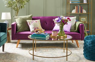
Leaman says her own design studio is grounded in blush tones, which she considers to be a neutral base. Even blues and greens, some of the complementary earth tones, have made their way into the neutral zone. “A blue-and-white scheme is so classic, and that can be viewed as a neutral even though it is a color,” she says. “It kind of depends on where you are coming from and who the client is, specifically.“
We’ve seen more muted color schemes work in so many different styles over many decades, so I think that’s what’s the key to their longevity (and appeal)."
Using Neutrals as a Starting Point
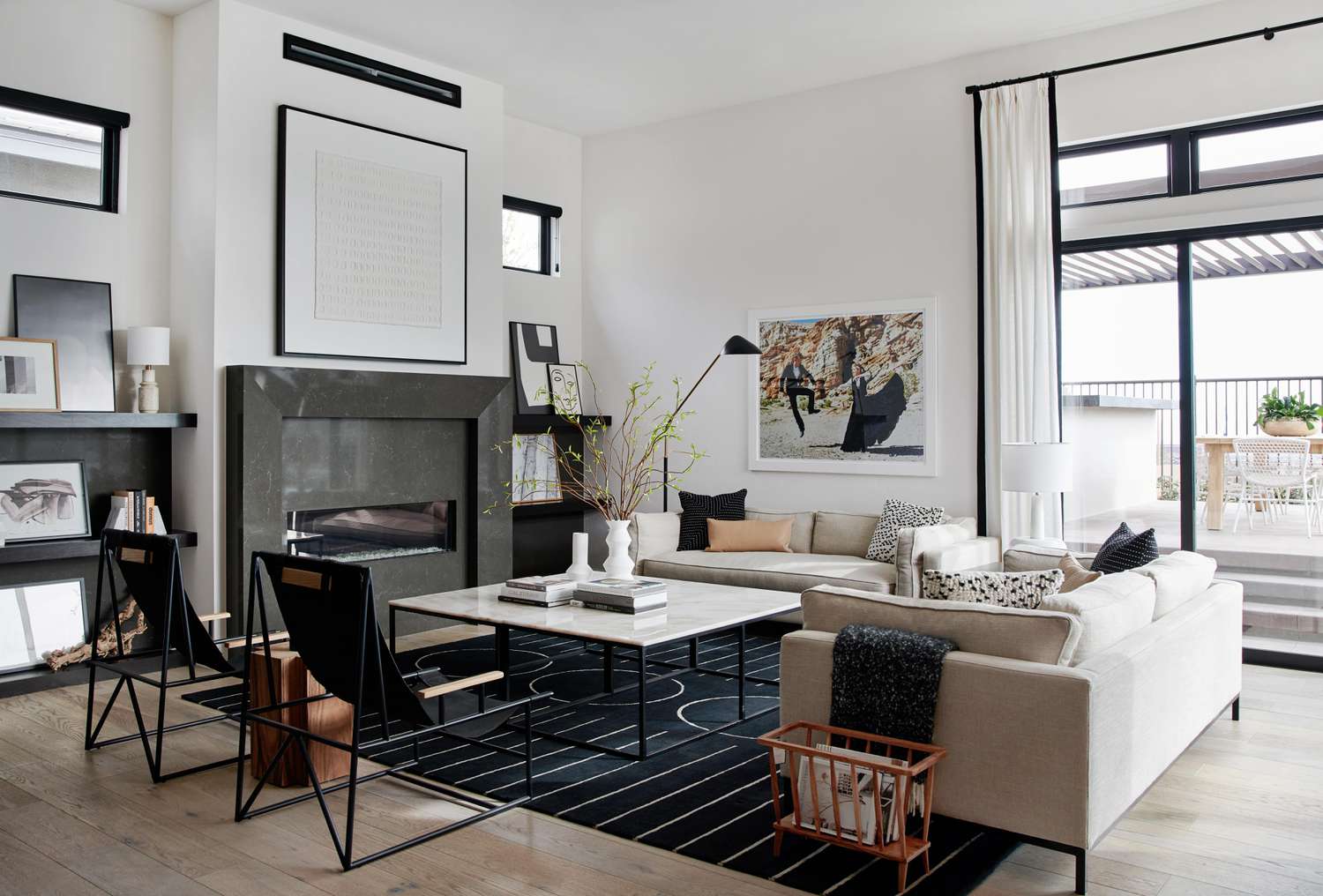
Designers use a variety of approaches to build on a neutral base to create a rich look for their clients. “Crisp white walls really allow me a lot of freedom to build a room, and instead of color, layer in a variety of materials, shapes, textures, and patterns,” Berk says. “Using all these elements adds so much visual interest, and sticking to neutrals means you won’t overwhelm the eye with too many tones.”
So it seems the consensus is that neutrals are here to stay, in some form or fashion. But why?
“A neutral color palette soothes our senses and reduces anxiety, but that doesn't mean our homes need to be void of color,” Spicher says. “The new neutrals are colorful but soft and muted so that we can feel cozy and safe. These new neutrals are also the perfect backdrop for layering natural wood, stone and real plants. You can achieve contrast by using neutral colors that are different textures. Think of natural wood and warm brass or copper or even a natural sisal rug and a cozy cable knit throw.”
Using your neutral tones of choice also makes it easier to change the look of your rooms. “If I have clients who want to bring a little more life or dynamic quality to the design, we bring in color with artwork, with pillows, with accessories, which are less expensive to swap out when you get tired of them,” Leaman says.”if you have a cream color or pale gray sofa, that is a huge investment that you are probably going to keep for years, and it is very easy to change that with different color pillow or throw.”
Expert Tips on Using Neutrals
Even with such a wide variety of neutrals out there, Ashton Woods’ Spicher shares some thoughts on using the colors to the best effect:
- Choose warm undertones or cool undertones and keep all of your color choices within this frame. For example, some white paints have a cool (blue) undertone; others have a warm (yellow) undertone. Try to avoid mixing these, especially if you apply an accent color.
- If you choose a deep "new neutral," like navy or black, be cautious about overusing it. Deeper, darker color can make a space feel small.
- Don't feel bound to one neutral color. The best spaces are dimensional with several different neutral colors layered into the same space.
Whichever neutral tone you treasure, this look’s enduring popularity proves you can always be on trend.